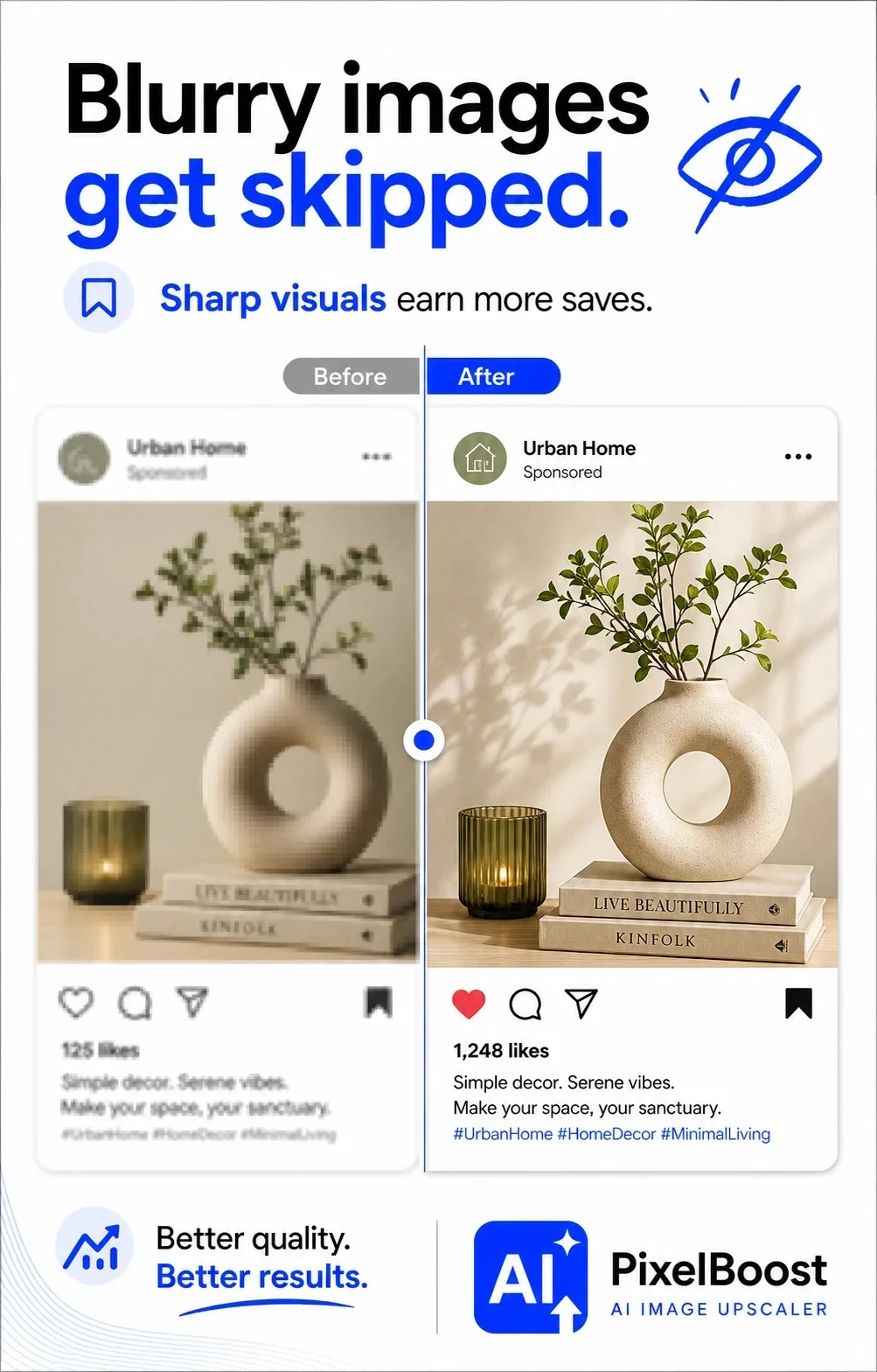
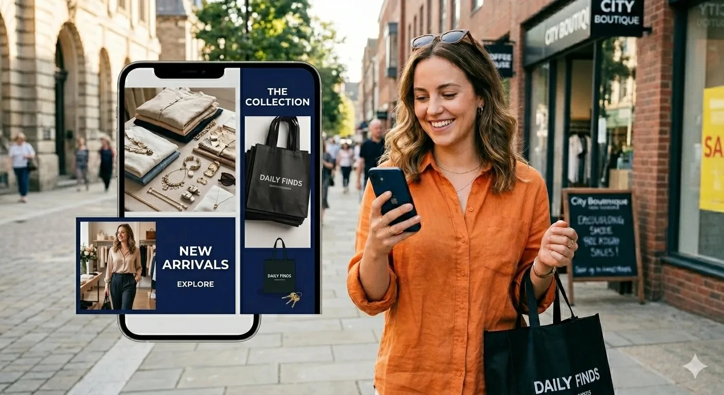
Think about the last time you actually stopped scrolling. It’s pretty much always a great image that makes you freeze. If your graphics look blurry, messy, or just super boring, everyone skips right past them. But look at it this way -tweaking your visuals is the easiest win out there to grab extra likes and saves without changing your whole strategy. Before posting your photos, you can make them better using online tools. This will make your images look sharp, clear, and professional.
Why you don’t need a massive budget
Here’s a secret: you don’t need an insanely expensive camera or a pro designer on payroll. It’s way simpler than that. You just have to nail a few basics. We’re talking about choosing clean source photos, getting the framing right, doing a bit of quick editing, and formatting files properly for each app. Once you bake this into your routine.
Start With Better Source Photos
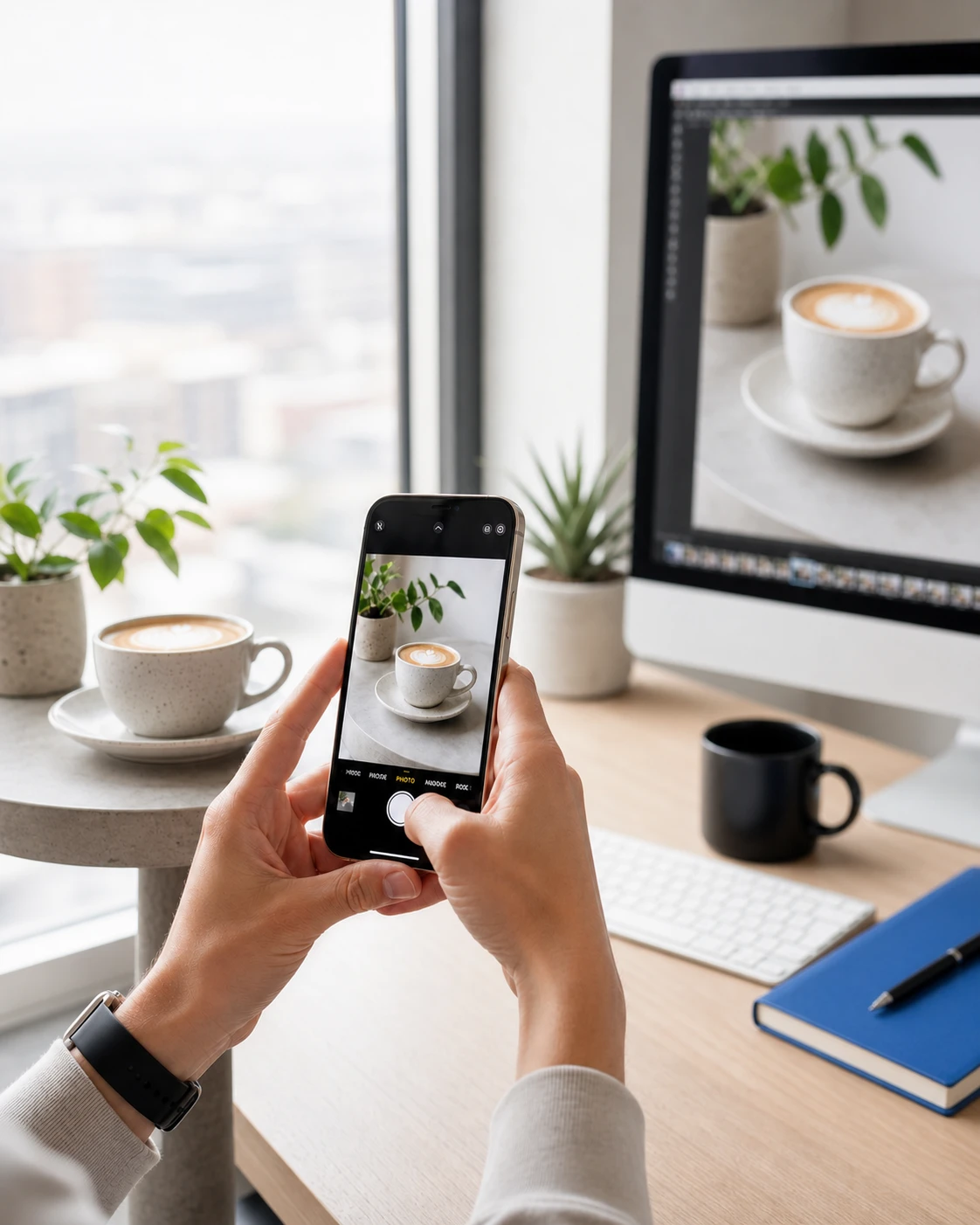
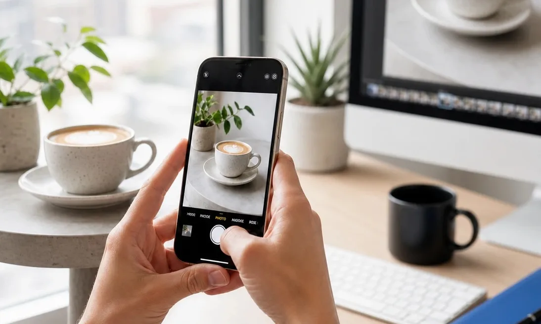
Start with the source material. Use the best version of the image you can get, not the file that has already been compressed five times in messengers. Photos taken in decent light with a recent smartphone are usually enough. What hurts quality most is heavy zooming, dark rooms, and shaky hands. Before you start editing, look at the image on a larger screen and zoom in a little. If small details are already broken or unreadable, the problem will be even more visible in the feed.
Nail your framing and focus
How you layout a photo changes everything. Mostly, people figure out what they’re looking at in a fraction of a second. Too much clutter? The brain just tunes out and the user scrolls past. Keep it simple: one post, one clear focus. Try zooming in, cropping the mess out of the background, and giving the main subject some breathing space. And seriously, don’t push key details right to the edge. Social apps love to auto-crop files and they’ll end up slicing off something important.
Drop the heavy filters (just do quick edits instead)
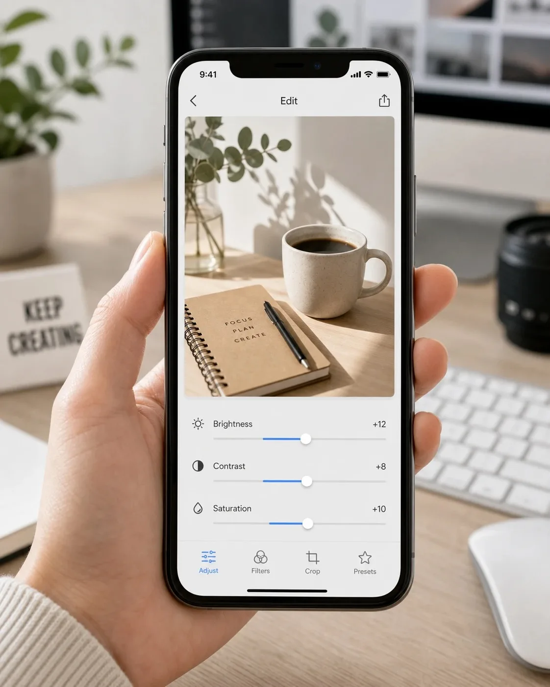
Once the shot looks clean, you only need a tiny bit of fine-tuning. Avoid those aggressive filters. Basic sliders work way better. If things look dark or muddy, just bump the brightness a notch. Tweak your contrast to bring out the shapes, and throw in a tiny bit of saturation so it looks alive but not completely fake. Want a shortcut? Build a couple of custom presets and stick to them. It keeps your feed looking cohesive, so people know it’s your post before they even catch the username.
Make things crisp
Blurry uploads ruin engagement, but a lot of pages just ignore it. Maybe a fuzzy photo flies under the radar in a quick 24-hour Story. But permanent feed posts or paid ads? They absolutely need to look clean. The problem is that scaling small images or aggressive cropping always leaves you with soft, ugly pixels. Don’t just stretch the file – use proper clarity or enhancement tools to actually bring back details. You don’t want that weird, over-sharpened AI look either, just avoid the washed-out mess where nothing stands out.
Stop using the exact same file everywhere
Every social app handles images differently, meaning you can’t just upload one file and hope for the best. It’s always smart to create a couple of distinct versions for your main graphics. A neat square crop might look awesome on one feed but get completely ruined and cut in half on another. Vertical layouts are your best bet for certain feeds, whereas horizontal dimensions work way better for link previews or banner posts.
Just find the recommended dimensions for whatever networks you like using and turn them into simple presets. Sure, exporting three different versions right now feels tedious, but it completely saves you from dealing with ugly auto-crops and cut-off text later.
Don’t overcomplicate text on your graphics
Putting text over an image is a tricky balancing act. Yeah, a bold header might get people clicking. If you have to use text, keep it super simple. Pick just one thing – like a single discount or a quick benefit. Use chunky fonts and high-contrast colors. Also, stay away from those skinny, curly scripts that look like a blurry smudge on a phone.
Try simple tests to see what hits
Stop guessing what your followers want and just look at what they actually do. A good trick is posting similar stuff but messing with the visuals a bit. Maybe make one photo bright, try another one with darker tones, or compare a super close-up shot with a wider angle. Leave it for a couple of weeks, then look at your shares and saves. You’ll probably find that a tiny crop adjustment or a different color vibe doubles your numbers, while some fancy, over-styled idea completely flops.
Forget perfection – just fix the obvious stuff
Look, you’re not trying to win a design award here. It’s mostly about getting rid of the basic mistakes that make people scroll past. We’re talking pixelated files, messy framing, ugly filters, or text no one can read. Once you clean up those fundamentals, your feed automatically looks way cleaner. Do that, and people will actually stop and tap your posts – which is exactly the kind of engagement you want.